About Us
About Us
CI/BI
- Corporate Wordmark
-
 POSCO's wordmark was designed to represent POSCO's transparent and responsible, customer centric mindset and its will to evolve into a global company. The five English alphabet letters of the wordmark hold its own independent shape while the letter S is placed in the center for equilibrium, representing POSCO's corporate culture of harmony and unity. The concentric circularity of the letters reflects POSCO's proactive stance in response to changes in the environment and the company's future prospects that will continue to evolve through innovation. The color of the wordmark is a calm, yet radiant shade of blue, epitomizing POSCO's corporate image that is both cutting-edge and eco-friendly.
 - Basic Corporate Wordmark
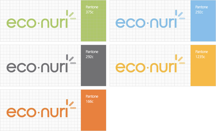
- Company Color System
-
-
POSCO Blue
Pantone 302C
Process Color : C 100, M 35, K 40
RGB Color : R5 -
Light Blue
Pantone 292C
Process Color : C 58, M 12 -
Light Gray
Pantone Cool Gray 4C
Process Color : Y 3, K 30 -
Dark Gray
Pantone Cool Gray 11C
Process Color : C 8, Y 5, K 82 -
Deep Yellow
Pantone 1235C
Process Color : M 35, Y 100 -
Orange
Pantone 166C
Process Color : M 77, Y 100 - Silver Pantone 877C
- Gold Pantone 872C
-
POSCO Blue
Pantone 302C
- Brand Wordmark
-
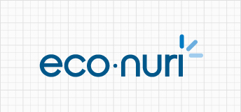
Content-related Aspect eco communicates the ecological and the economical while nuri, meaning "world" in pure Korean, connotes POSCO's pledge to "illuminate the entire world with the light of trust."
Image-related Aspect The use of blue lettering signifies eco nuri's a affiliation with the symbol of steelmaker POSCO and the "smartness" and reliability of eco nuri as a lighting brand. The three lines accentuate the logo as a figurative representation of rays of light to shine upon the world. - Logo Spacing Guidelines
-
A minimum amount of space surrounding the logo is required in order to preserve its formative characteristics.
Mandatory guidelines regarding spacing include Spacing Rule A and Spacing Rule B.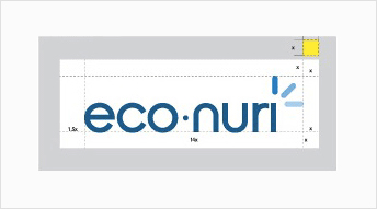 Spacing Rule A A sufficient amount of clear space according to spacing regulations is required when applying the logo. If the length of the logo is 14x, x amount of space should be set aside on the top, bottom and right-hand sides. The left must include spacing of 1.5x.
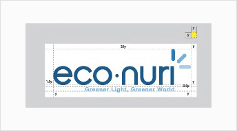 Spacing Rule B For billiboards, signs, print material and other media for which legibility is key, Spacing Rule B can be applied to ensure legibility in the case of limited spacing. If the length of the logo is 25y, the top, bottom and right-hand sides should have y amount of space while the left must include spacing of 1.5y.
 - Logo+Slogun Spacing Guidelines.
-
A minimum amount of space surrounding the logo is required in order to preserve its formative characteristics.
Mandatory guidelines regarding spacing include Spacing Rule A and Spacing Rule B.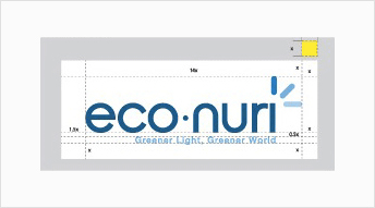 Spacing Rule A A sufficient amount of clear space according to spacing regulations is required when applying the logo. If the length of the logo is 14x, x amount of space should be set aside on the top, bottom and right-hand sides. The left must include spacing of 1.5x.
 Spacing Rule B For billiboards, signs, print material and other media for which legibility is key, Spacing Rule B can be applied to ensure legibility in the case of limited spacing. If the length of the logo is 25y, the top, bottom and right-hand sides should have y amount of space while the left must include spacing of 1.5y.
 - Basic Colors
-
In principle, the logo should be placed on a white background.
-

-
Pantone 302C
Process Color : C 100, M 35, Y 0, K 40 -
Pantone 300C
Process Color : C 100, M 35, Y 0, K 0 -
Pantone 284C
Process Color : C 55, M 19, Y 0, K 0 -
Pantone 283C
Process Color : C 55, M 19, Y 0, K 0
-
- Black and White
-
This cannot be used in media other than those in black and white.
-

- K 100
- K 90
- K 70
- K 50
-
- Sub Colors
-
Sub Colors should apply one-degree Pantone colors.
Korean Typeface Yoon Gothic Family English Typeface Helvetica Neue Family